macOS Tahoe 26 Liquid Glass Settings Guide
macOS Tahoe 26 Liquid Glass Settings: Transparency Guide
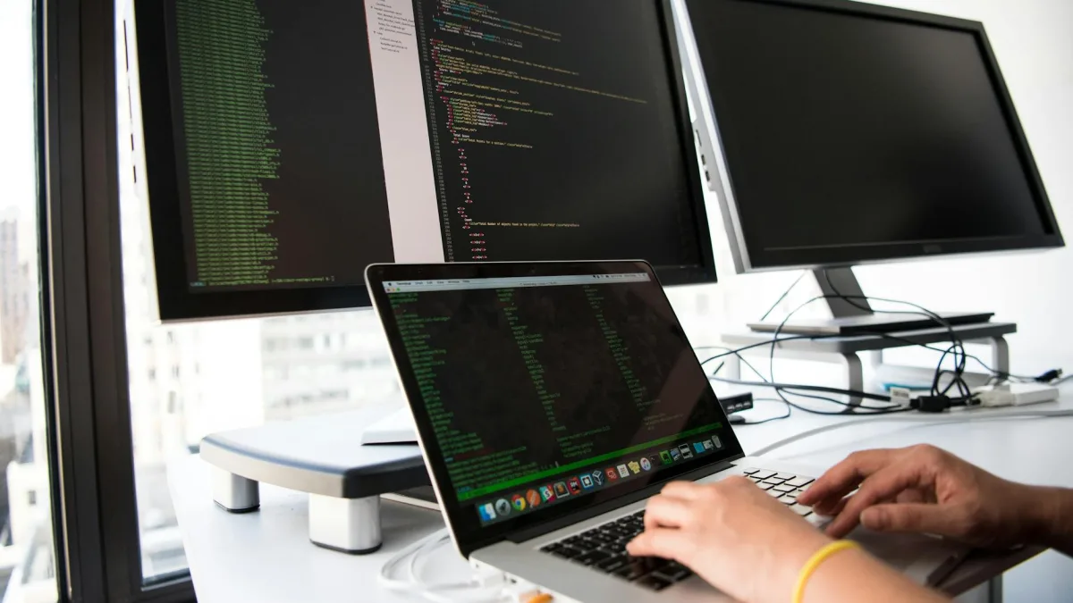
macOS Tahoe 26 brings the Mac interface into a glassier, semi-transparent, more dynamic look with its Liquid Glass design. The menu bar, Dock, app sidebars, toolbars, icons, and some system panels now reflect more of the content behind them. At first glance, it looks very polished; especially when paired with a simple wallpaper, a tidy desktop, and dark mode, the Mac feels more open and spacious. But this may not be the most comfortable option for everyone. Some users may find text harder to read, menus too bright, or transparency distracting. That is why macOS Tahoe 26 Liquid Glass settings are not just about aesthetics; they are also about everyday comfort.
Liquid Glass does not work like a classic theme that can be completely turned off with a single switch. Since Apple has spread this design across the system, the goal is not so much to turn the interface back into old macOS, but to reduce its intensity, improve readability, and make the desktop better match your way of working. In other words, the right expectation is this: you can manage Liquid Glass, soften its effect, reduce the feeling of transparency, simplify icons, and increase contrast. With a few small adjustments, it is possible to keep Tahoe’s fresh look while making the interface easier on the eyes.
The first place to check is the Appearance section in System Settings. Click the Apple menu, open System Settings, then choose Appearance from the sidebar. The Light, Dark, and Auto appearance options can significantly change how Liquid Glass feels. Light mode creates a brighter, glassier impression, while Dark mode makes transparent areas feel calmer. Auto can be a good middle ground for users who want a brighter look during the day and a more comfortable interface in the evening, as it switches between Light and Dark depending on the time of day. If Liquid Glass feels too vivid, try Dark mode first, because for many users it provides the quickest relief.
Icon appearance has also become more customizable with Tahoe. In Appearance settings, you may see options for icons such as light, dark, tinted, or a style closer to transparent. Transparent or glass-like icons make the desktop look modern, but they can make icons harder to distinguish if you use a crowded Dock. Tinted icons, on the other hand, appeal to users who want a more unified desktop. A small rule of thumb helps here: if your wallpaper is very colorful, choose a simpler icon style; if your wallpaper is plain and calm, tinted icons may look better. The same logic applies when adjusting visual settings on other systems too; for example, Windows users looking to make their screen easier to read may find a similar practical approach in screen brightness settings in Windows 10.
One of the settings that reduces the Liquid Glass effect the most is found in the Accessibility menu. Open System Settings, go to Accessibility, and find the Display option. When you enable Reduce Transparency, menus, panels, and some interface areas gain a flatter background. This setting does not remove Liquid Glass completely, but it noticeably calms the glass effect. Text becomes easier to read especially in the Finder sidebar, Control Center, notifications, and menu areas. For users who look at the screen for long periods, have eye sensitivity, or work with many windows on the desktop, this setting is often the most important adjustment.
If Reduce Transparency alone is not enough, you can also check the Increase Contrast setting in the same Display section. This makes the edges of interface elements and text separation more visible. However, its effect is a little sharper, meaning it can reduce the softer side of the design. That is why it makes more sense to try only Reduce Transparency first and use it for a few hours. If menus still look confusing, then enable Increase Contrast. Increasing contrast can make a noticeable difference especially for users with bright wallpapers, those who prefer Light mode, and people working on external monitors.
The menu bar is one of the most visible areas of the Liquid Glass feel in Tahoe. A transparent menu bar makes the screen look wider and cleaner, but if the background contains a moving or very colorful image, the clock, Wi-Fi, battery, and app menus can become harder to see. Start by testing your wallpaper. If you use a detailed nature photo, city view, or patterned image, constantly shifting colors appear behind the menu bar. Choosing a calmer wallpaper improves readability independently of Liquid Glass settings. Solid-color, slightly blurred, or dark-toned backgrounds tend to look more balanced with the Tahoe interface.
The Control Center and menu bar layout are also worth reviewing. In System Settings, open Control Center and decide which controls should appear in the menu bar. Keeping Wi-Fi, Bluetooth, Sound, Display, Battery, Focus, and similar controls all in the top bar may seem practical, but a crowded menu bar feels even heavier over Liquid Glass. Leaving controls you do not use often inside Control Center makes the top area cleaner. This small cleanup is especially noticeable on smaller screens such as the MacBook Air or 13-inch-class devices.
A similar approach applies to the Dock. If you keep too many apps in the Dock, icon clutter sits on top of the Liquid Glass effect. To simplify the Dock, drag out apps you do not use and leave only the ones you open daily. In the Desktop & Dock section of System Settings, you can adjust the Dock size, magnification effect, and screen position. Automatically hiding the Dock is a good option for users who want a cleaner desktop. This way, Liquid Glass appears more when you need it and does not constantly pull your attention.
Because folder appearance has become more playful in Tahoe, organizing the desktop can also be considered part of the Liquid Glass experience. You can make folders easier to distinguish by adding colors, symbols, or emojis. At first, this may look cosmetic, but it is genuinely useful for someone who works intensely. For example, using different colors for work files, personal documents, screenshots, and temporary downloads can reduce the feeling of getting lost in Finder. If the idea of organizing basic settings after installing a new operating system sounds useful, the practices in 10 settings to adjust after installing Ubuntu 26.04 LTS may feel familiar on the Linux side as well.
One of the simplest ways to use Liquid Glass comfortably is to avoid changing every interface setting at once and leaving it there. First, switch the appearance to Dark or Auto mode, then work normally for a few hours. Next, enable Reduce Transparency and try again. If needed, increase contrast, simplify the menu bar, clean up the Dock, and change the wallpaper. This approach is healthier because if you enable everything at the same time, it becomes harder to understand which change actually helped. Think of your Mac not as a design demo, but as the workspace you use every day.
Some users may feel like they want the old look back after upgrading to Tahoe. That is understandable, because macOS had followed a more stable and matte interface style for years. But a little adjustment is often enough to get used to Liquid Glass. If the issue is not only visual habit, but menus are hard to read, windows are difficult to distinguish, or your eyes feel tired, do not hesitate to use Accessibility settings. These settings are not only for people with vision difficulties; they are also for anyone who wants a clearer and more comfortable screen. For Windows users dealing with system behavior and visual issues, Windows 11 Errors: Common Issues and Easy Fixes follows a similar approach by checking basic settings first.
If you use an external monitor, test Liquid Glass settings on that screen as well. Transparency that looks good on a MacBook display may not produce the same result on a monitor with lower contrast or a different color profile. In System Settings, open Displays and check options such as brightness, color profile, and True Tone. Brightness level directly affects how Liquid Glass feels, especially for users working under office lighting. Very high brightness can make the glass effect harsher, while very low brightness can make text look faded. The ideal point is usually adjusted according to the ambient light around the screen.
A good Liquid Glass setup in macOS Tahoe 26 is not about suppressing the new design completely, but about adapting it to your eyes and workflow. When Dark mode, reduced transparency, stronger contrast, a clean menu bar, an organized Dock, and a calm wallpaper are used together, Tahoe feels much more balanced. Once you try a few settings and find your own rhythm, Liquid Glass stops being just a shiny novelty and becomes a natural part of making the Mac feel more spacious and personal.